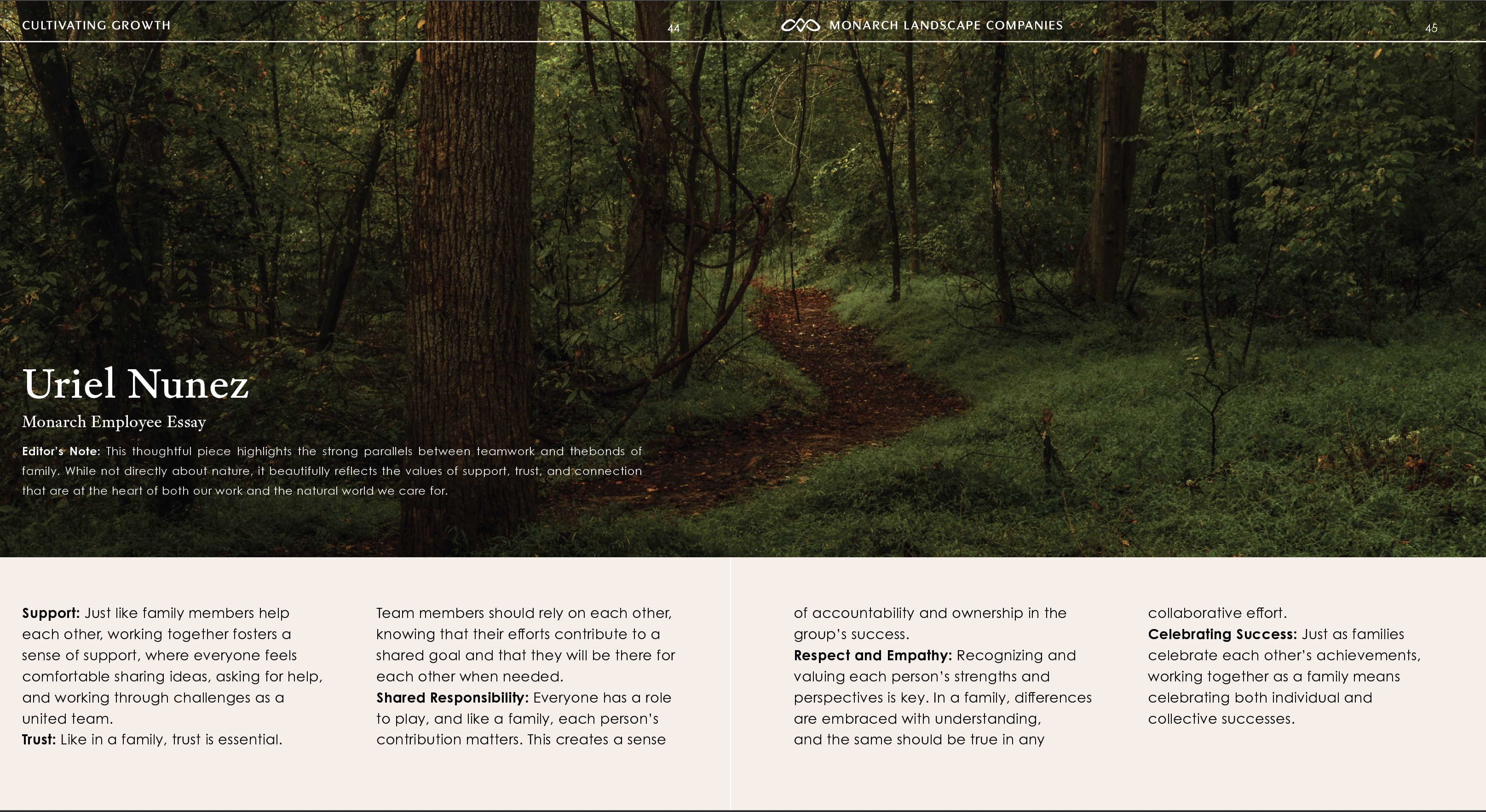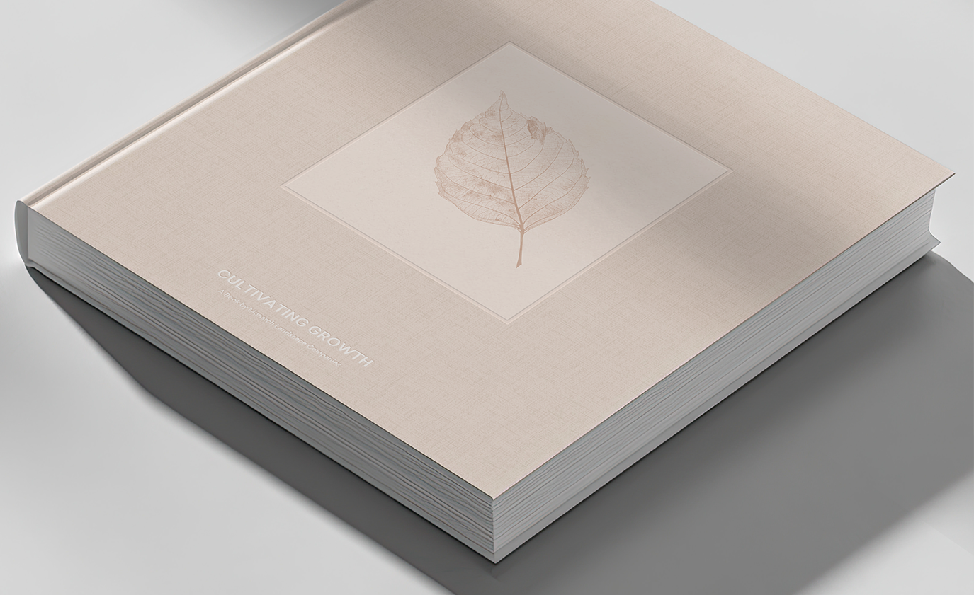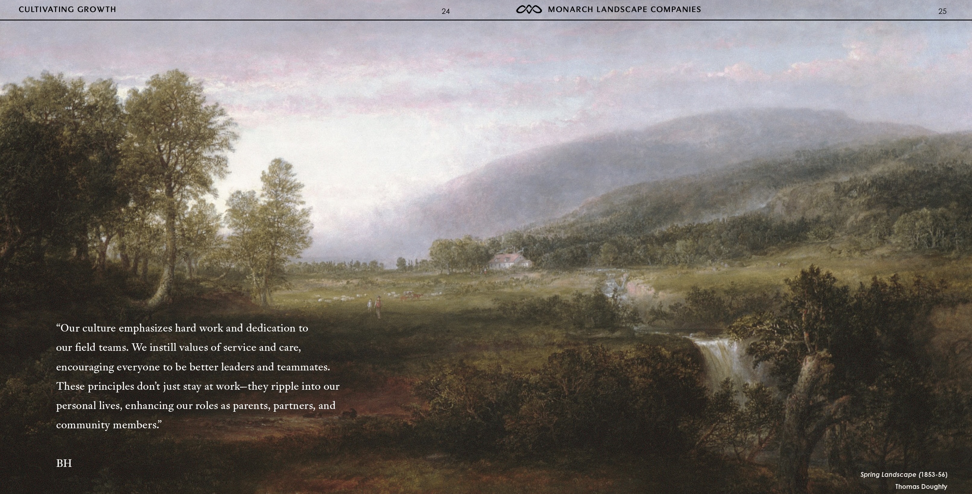


We developed a strategic "Endorsed Brand Architecture" to bridge the gap between corporate unity and local autonomy.We moved away from generic "landscaping green" tropes, introducing a sophisticated color palette featuring Poppy (a bold red-orange), Fog, Sand, and Midnight. The new logo features a strong, capitalized wordmark paired with an organic icon representing the interconnected nature of the alliance.We created a design system where regional brands operate independently but share Monarch’s visual DNA through typography and the unifying endorsement line: "A Monarch Landscape Company". To solidify internal culture, we designed and produced a physical book titled Cultivating Growth. Far from a standard handbook, this was an art object containing poetry, photography, and reflections on nature from staff, the CEO, and notable authors.